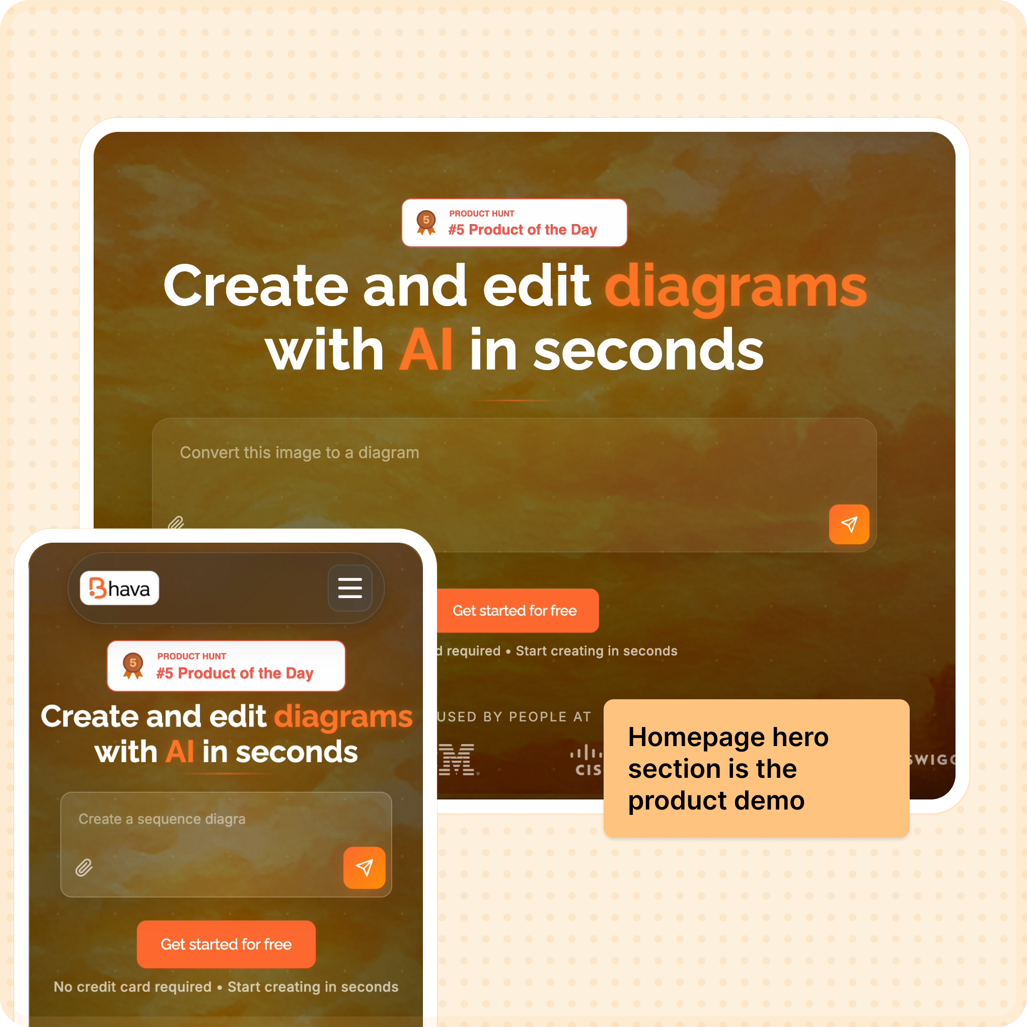
Side project · AI diagramming

From messy AI outputs to clean, editable diagrams.

Bhava is my nights-and-weekends AI tool built with one part-time engineer. I lead everything from product discovery to shipped experiments-driving 60% activation, 5% landing weeks.

Role

Founder & Designer

Timeline

4 Weeks

Key Outcome

60% Activation

Prompt strategy Trust signals Pricing & retention AI evals

Product discovery

Mapped workflows, ran 8 interviews, and sized activation gaps before touching UI.

Trust-led UX

Turned the prompt into a guided demo, added progress states, and rebuilt onboarding.

Growth experiments

Removed free mode, shipped usage-based pricing, and tracked retention + MRR weekly.

AI evaluation

Logged 100+ failed diagrams, clustered errors, and guided sub-agent strategy to lift accuracy.

60%

Activation lift

1,600+

Early users

25

Paying teams

4

Renewals sealed

Bhava hero collage interface preview

Guided AI diagramming that feels reliable

I turned Bhava from a promising hack into a trust-first workspace where the AI shows its work, asks for the right context, and outputs clean, editable diagrams.

  • Lifted activation to 60% by pairing prompt presets, progress states, and failure logging with weekly eval loops.
  • Aligned monetization with value by removing free mode, adding usage-based billing, and tracking retention + MRR weekly.
The Messy Middle

Process & Iterations

From hacked-together prototypes to a polished product.

Prototype 01

Text box with zero guidance

The first build was a blank prompt. Users froze because the AI gave no hints or previews, so we added suggested prompts, live thinking states, and “show your work” logging.

Pricing sketch

Credit-based plans

We mapped out credits per plan to cap abuse and force value alignment. This later informed the usage-based billing that filtered out low-intent signups.

Activation guardrails

Guided first win

Built an onboarding path that asks for system type, generates a diagram with context, then shows a repair checklist if quality is low—lifting activation to 60%.

What failed: We launched with a "Free Forever" tier that limited features. It attracted spam and low-quality usage. Switching to a "Free Trial + Paid Only" model filtered for serious users and improved feedback quality.

Context

Why we built this

Every week, I watched designers redraw the same diagram-like déjà vu with arrows.

I'm a product designer at an ad-tech startup. By day, I'm deep in B2B dashboards. By night, I watch my team waste hours redrawing the same system diagram in Figma, Draw.io, Excalidraw, and Miro.
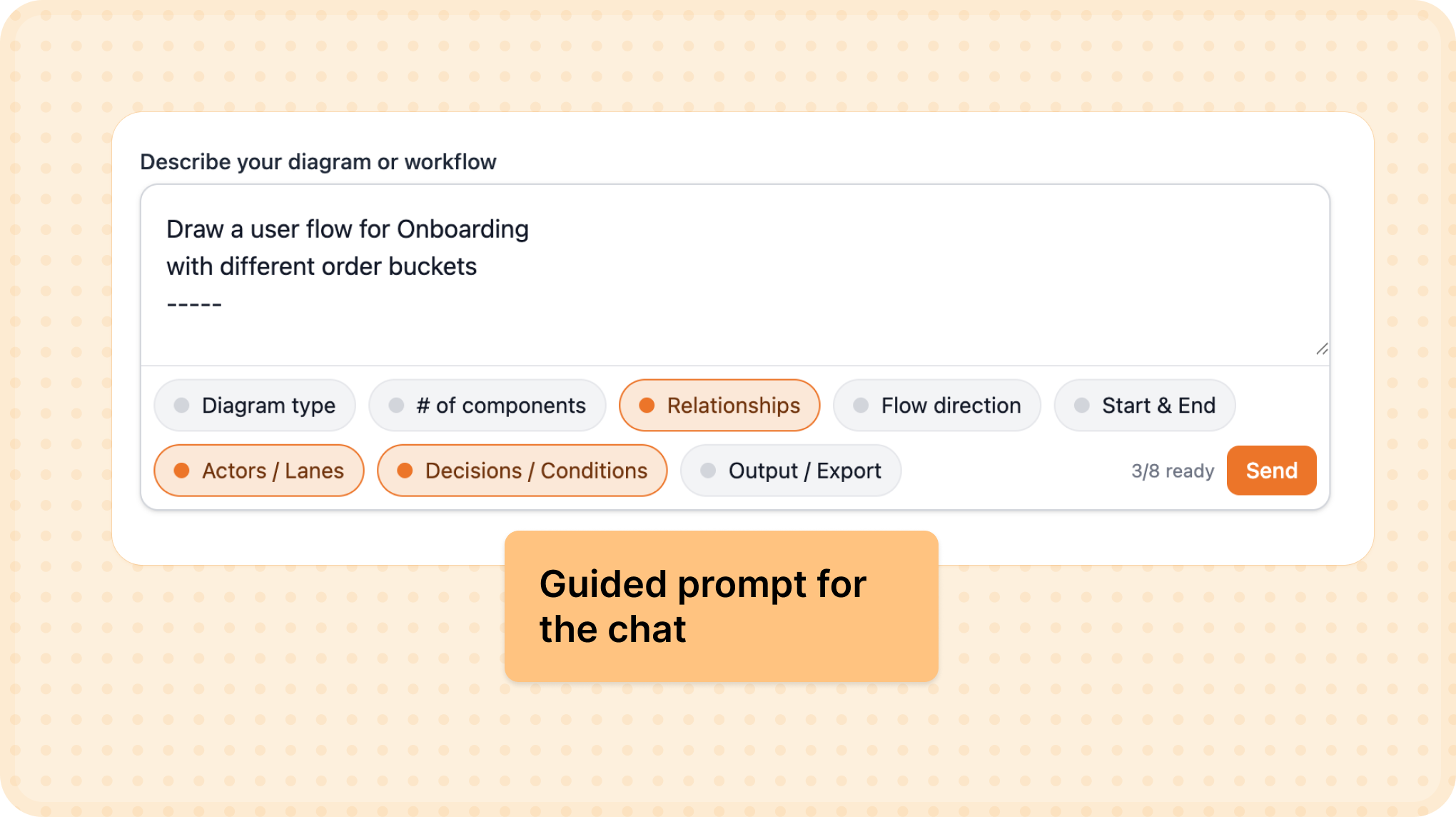
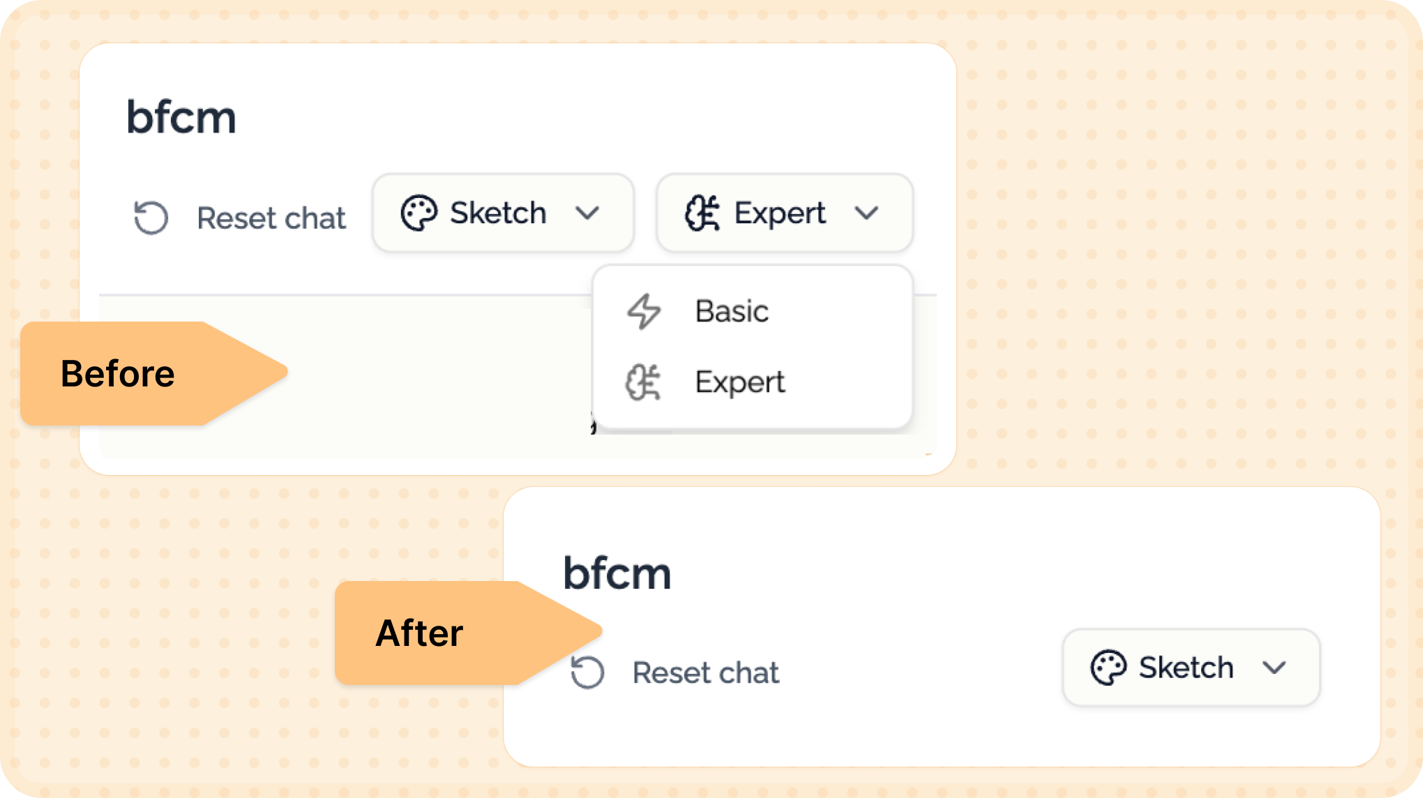
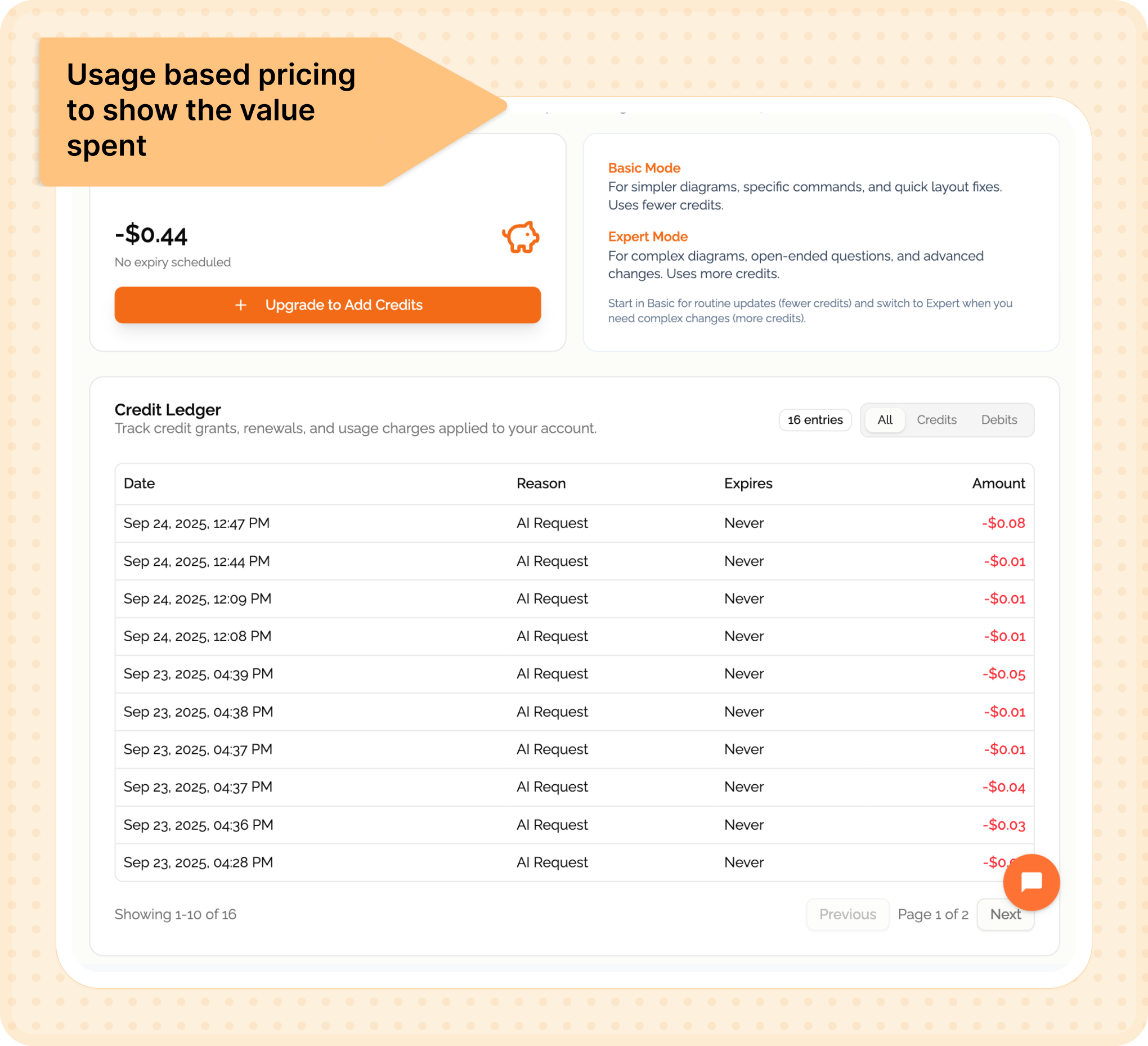
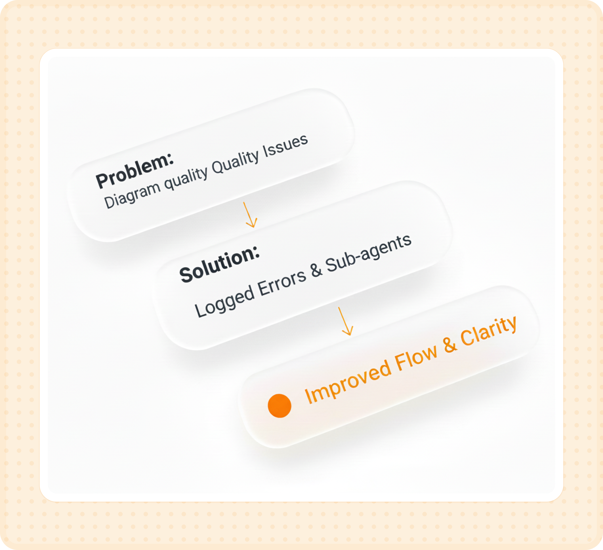
Same workflow. Four different tools. Different versions. Complete chaos.

So I started building Bhava-an AI tool that generates diagrams instantly. But more importantly, one that doesn't feel like a black box.

What Bhava looked like before vs after the trust redesign

This is early stage. We're 4 weeks post-launch with ~2,500 users and $250–300 MRR. I work on this part-time alongside my full-time job. One engineer friend helps part-time. Between us, I handle design, product, evals, UI fixes, pricing experiments, and customer interviews. He handles optimization and infrastructure.

This is the story of how we went from a fuzzy idea to 60% activation-and what I learned about building AI products people actually trust.

The problem

Broken workflows, broken trust

🔀

Diagramming was fragmented

  • Engineers used Draw.io
  • Designers used Figma
  • PMs used Miro
  • Same diagram, 4 places, 30+ minutes each time
🤔

AI tools fell short

  • Vague prompts → broken diagrams
  • No feedback while AI "thought" → mistrust
  • Failures with zero explanation
The activation problem: In early tests, only 38% of users created their first diagram. The other 62% bounced without trying.
"AI doesn't need to be perfect-it just needs to show it's trying."

Our bet: Build on top of Draw.io (largest user base) and make AI feel reliable, not random.

Approach

Designing for trust

Every design decision mapped back to a trust framework for AI research

01

Ability

Can the AI actually do the task?

02

Benevolence

Does it feel like it's helping me?

03

Integrity

Is it honest about what it can and can't do?

04

Reliability

Does it work consistently?

Discovery

Understanding the drop-off

Before redesigning anything, I spent 2 weeks analyzing user behavior-watching session recordings, tracking prompts, and interviewing people who churned.

8

User Interviews

Deep dives with designers and PMs who churned within 48 hours

12

Hours of Sessions

Analyzed recordings to identify drop-off patterns and friction points

3

Usability Tests

Live observation of first-time users attempting diagram creation

User Journey: First-Time Experience

👀

Discovery

Lands on homepage via Product Hunt or Twitter

Curious, skeptical

😕

Sign Up

Creates account, sees empty editor

Confused, uncertain

Blank Canvas

Stares at text box with no guidance

Paralyzed, frustrated

Waiting

Hits generate, sees spinner for 7 seconds

Anxious, doubting

👎

Failure Point

Gets poor result or gives up

Disappointed, churns

01

Blank canvas paralysis

Users landed on an empty editor with no guidance, no examples. They froze.

02

Mode confusion

"Intelligent" vs "Basic" results varied wildly. Trust eroded fast.

03

No progress feedback

3–8 seconds of spinner. No updates. Pure anxiety.

04

Hidden export

Only 15% exported their first diagram. The happy path was invisible.

What users told us

"

I don't know what to type, so I just close the tab.

L
Lisa Martinez
Product Manager
"

Why does intelligent mode give me different results?

K
Kevin Zhang
UX Designer
"

It's just spinning... is it even working?

R
Rachel Kim
Engineer
"

Where do I export this diagram?

D
David Patel
First-time user
"The activation gap is usually a clarity gap-not a capability gap."

The Landscape

Understanding how Bhava stacks up against existing diagramming solutions

Draw.io / Diagrams.net

  • Free and open-source
  • Massive feature set (200+ shapes)
  • Manual drag-and-drop workflow
  • Steep learning curve
  • No AI assistance

Lucidchart

  • Professional-grade tool
  • Real-time collaboration
  • Templates library
  • $7.95-$9/user/month
  • Still primarily manual

Miro / FigJam

  • Infinite canvas approach
  • Excellent for brainstorming
  • Team collaboration features
  • Not diagram-focused
  • Overkill for simple diagrams

ChatGPT + Plugins

  • Can generate diagrams via text
  • Outputs often poorly formatted
  • No direct editing capability
  • Multi-step export process
  • Black-box generation

Why Bhava Is Different

Instant Generation

AI-first approach cuts diagram creation time from 30 minutes to 30 seconds

🔍

Trust-First UX

Shows reasoning, progress states, and allows editing—not a black box

📤

True Portability

Export to editable Draw.io, PNG, SVG—works with existing tools

🎯

Guided Experience

Presets and examples eliminate blank canvas paralysis

What I shipped

Six experiments that moved metrics

Each redesign tackled a specific trust or activation gap. Here's what worked.

First we fixed clarity, then trust, then monetisation.

Phase 1: Onboarding & Clarity

Getting users to understand what to do and how to start

Homepage prompt with guided examples
New homepage prompt: Large interactive demo with example chips showing what users can create (e.g., "User journey map for an e-commerce app"). Visitors can test the product before signing up, lifting landing conversion from 1% → 5%.
Experiment 01

Homepage prompt became the product demo

Problem: Vague CTAs meant visitors signed up without understanding what to type.

Solution: Elevated a giant prompt box with example chips and a mini walkthrough so users preview the experience before creating an account.

Before
  • Generic "Try for free" button
  • No preview of what product does
  • Users signed up blind
  • 1% conversion rate
After
  • Interactive prompt with examples
  • Live demo before sign-up
  • Users understand value upfront
  • 5% conversion rate (+4pp)
1% → 5% Landing conversion (+4pp)
45s → 12s Time-to-first-prompt
Guided onboarding cards
Guided onboarding experience: Diagram-type cards (Flowchart, System Architecture, User Journey) with contextual hints and 3-step progress indicator. This structure eliminated blank canvas paralysis, boosting activation from 38% → 60%.
Experiment 02

Guided prompt experience replaced the blank chat

Problem: New users froze on an empty chat and churned without generating anything.

Solution: Added diagram-type cards, contextual hints, and a three-step progress indicator that nudges people into action.

Before
  • Empty text box, no guidance
  • Users didn't know what to type
  • No indication of capabilities
  • 38% activation rate
After
  • Diagram-type selector cards
  • Contextual prompt hints
  • 3-step progress indicator
  • 60% activation rate (+22pp)
38% → 60% Activation (+22pp)
+18% Prompt quality scores
"Clarity unlocks activation. But trust keeps users coming back."

Phase 2: Trust & Quality

Building reliability into the product experience

Premium generation screen
Premium-only experience: Removed the inconsistent "Basic" mode and offered one high-quality premium generation for free trials. This bold move cut "bad diagrams" support tickets by 55% and stabilized Day-7 retention at 30%.
Experiment 03

Removing free mode protected trust

Problem: The legacy "Basic" mode produced low-quality diagrams that tanked perceived reliability.

Solution: Sunset the free mode, offered one premium try, and introduced usage-gated access to keep output quality consistent.

30% Day-7 retention (stabilized)
−55% "Bad diagrams" support tickets
"Monetisation isn't just about pricing-it's about signalling reliability."

Phase 3: Pricing & Evaluation

Aligning value with sustainable monetisation

Usage-based pricing screen
Usage-based pricing model: $10 base plan with transparent credit packs and real-time usage tracking. Turned unprofitable unlimited plans into sustainable revenue, flipping contribution margin from -22% to +14%.
Experiment 04

Usage-based pricing matched value to spend

Problem: Unlimited $10/month plans were unprofitable and encouraged abuse.

Solution: Swapped to a $10 base plan with transparent credit packs and real-time usage tracking.

$30 First enterprise add-on purchase
−22% → +14% Contribution margin flip
Usage dashboard
Usage dashboard: Always-available tutorial and transparent usage tracking showing credits, generation modes, and expiry dates. Reduced billing-related support questions by 60% and improved NPS on transparency by 1.2 points.
Experiment 05

Usage clarity reduced support debt

Problem: Pricing changes created confusion-users couldn't tell where credits went.

Solution: Built an always-available tutorial and a usage dashboard detailing credits, modes, and expiry.

−60% Billing questions
+1.2 pts NPS on transparency
Manual evaluation log
Manual evaluation process: Logged ~100 failed diagram generations, clustered error patterns by diagram type, and routed high-volume types (flowcharts, system diagrams) through specialized sub-agents. Improved flowchart success rate by 70% while keeping costs flat through prompt caching.
Experiment 06

Manual evals powered sub-agent quality

Problem: Diagram quality varied by type and we lacked clarity on failure patterns.

Solution: Logged ~100 failed diagrams, clustered errors, and routed high-volume types through specialized sub-agents.

+70% Flowchart success rate
Flat Costs (thanks to caching)
4 weeks post-launch

Current metrics

A snapshot of where things stand after the first month of shipping.

📈
Activation Rate
38% 60%
+22 percentage points ↑

Users who signed up and created their first diagram. Guided onboarding was the key driver.

🎯
Landing Conversion
1% 5%
+4 percentage points ↑

Homepage prompt demo let visitors understand the product before signing up.

Generation Speed
7.8s 3.2s
59% faster (p50 latency)

Prompt caching and optimization reduced median diagram generation time.

💰
Cost Efficiency
$0.08 $0.048
40% cost reduction

Per diagram cost after implementing prompt caching on Claude API.

💵
Monthly Revenue
$150-200
First month baseline

MRR from ~30 paying customers after switching to usage-based pricing.

🔄
Day-7 Retention
30%
Stabilized post-pricing shift

Users who return and create another diagram within first week.

Reflection

What broke, what worked

Failures

  • Template gallery: zero usage, removed quickly
  • Three free tries: people churned emails, costs spiked
  • Basic mode: poor quality eroded trust
  • Five-step onboarding: too long, trimmed to three

Wins

  • Homepage prompt lifted conversion 4pp
  • Progress indicators stopped mid-gen refreshes
  • Caching reduced costs by 40%
  • Quality-first approach kept users returning
"I learned that AI trust is built in microseconds, even a7-second latency feels fine only when users see progress."

Deeper reflections

Trust compounds, but so does mistrust. One broken diagram erodes more trust than five perfect ones build. That's why removing the "Basic" mode-even though it cut our free tier-was the right call. Quality consistency matters more than feature breadth in AI products.

Monetisation isn't just about pricing, it's about signalling reliability. When we introduced usage-based pricing, we weren't just managing costs-we were telling users "this output is valuable enough to meter." Paradoxically, charging more increased trust because it signalled we stood behind the quality.

Progress indicators are trust multipliers. The same 7-second generation time feels entirely different when users see "Analyzing structure... Generating nodes... Optimizing layout" versus a blank spinner. Transparency about what's happening builds confidence even when things take time.

The activation gap is usually a clarity gap. Our jump from 38% to 60% activation wasn't about making the product better-it was about making it clearer. Users didn't know what to type, so they didn't try. The moment we showed examples, they understood the possibility space.

What I'd do differently

  • Set up analytics on day one (not week two)-we lost critical early behavior data
  • Start manual evals earlier to catch quality issues before users did
  • Test pricing experiments faster-waiting cost us margin and user trust
  • Interview churned users within 24 hours while their frustration was fresh and specific
What's next

Future bets

Shipping soon (2–4 weeks)

  • "Explain this diagram" overlays
  • One-click export to PNG, SVG, PDF
  • Diagram versioning

Exploring

  • Team collaboration (comments, shared workspaces)
  • API access (10 inbound requests)
  • Template starter packs

Said no to

  • Custom branding (low demand)
  • Slack/Notion integrations (unclear ROI)
  • White-label offering (not before $2K MRR)
Honesty

Risks I'm owning

  • Four weeks is too early to claim product-market fit
  • Need to track day-30 and day-60 retention before declaring success
  • Export rate stuck at 15%-my next focus area
  • Eval rubric is v1; still manually labeled and somewhat subjective
  • Some metrics estimated; refining instrumentation
  • Pricing tests ongoing; willingness-to-pay still forming