 BhavaCase study 04
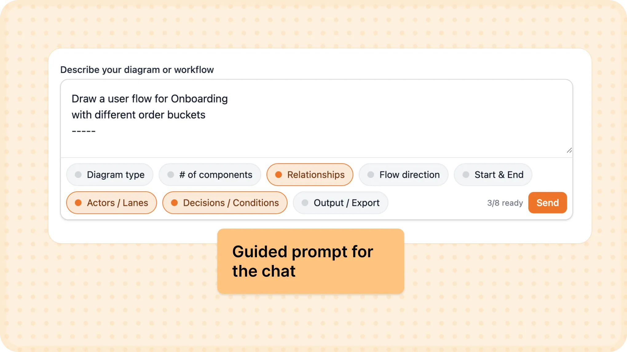
Give people a starting point they can change
Side Project · AI Diagramming · Bhava
The first diagram starts before the first prompt.
A blank prompt asks people to explain what they want before they know what a tool can do. I built Bhava after seeing teams redraw the same system diagram in four tools. As founder and product designer, I handled design, shipping, and weekly evaluations. The job was to help someone start, then give them a diagram they could keep working on.
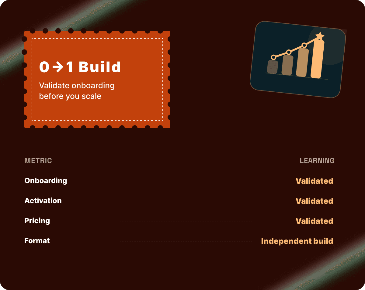
Examples, editable output, and visible progress helped early activation move from 38% to 60% in my AI diagramming side project.
The empty field was already asking too much
Only 38% of early signups created a first diagram. The rest left without trying. Before generation quality could matter, people needed to know what to type. After they submitted a prompt, a silent spinner gave them another question: was anything happening?
These were different breaks in the same journey. One stopped people from beginning. The other left them uncertain while they waited.
“I don't know what to type, so I just close the tab.”
“It's just spinning… is it even working?”
Show a possible answer before asking for a prompt
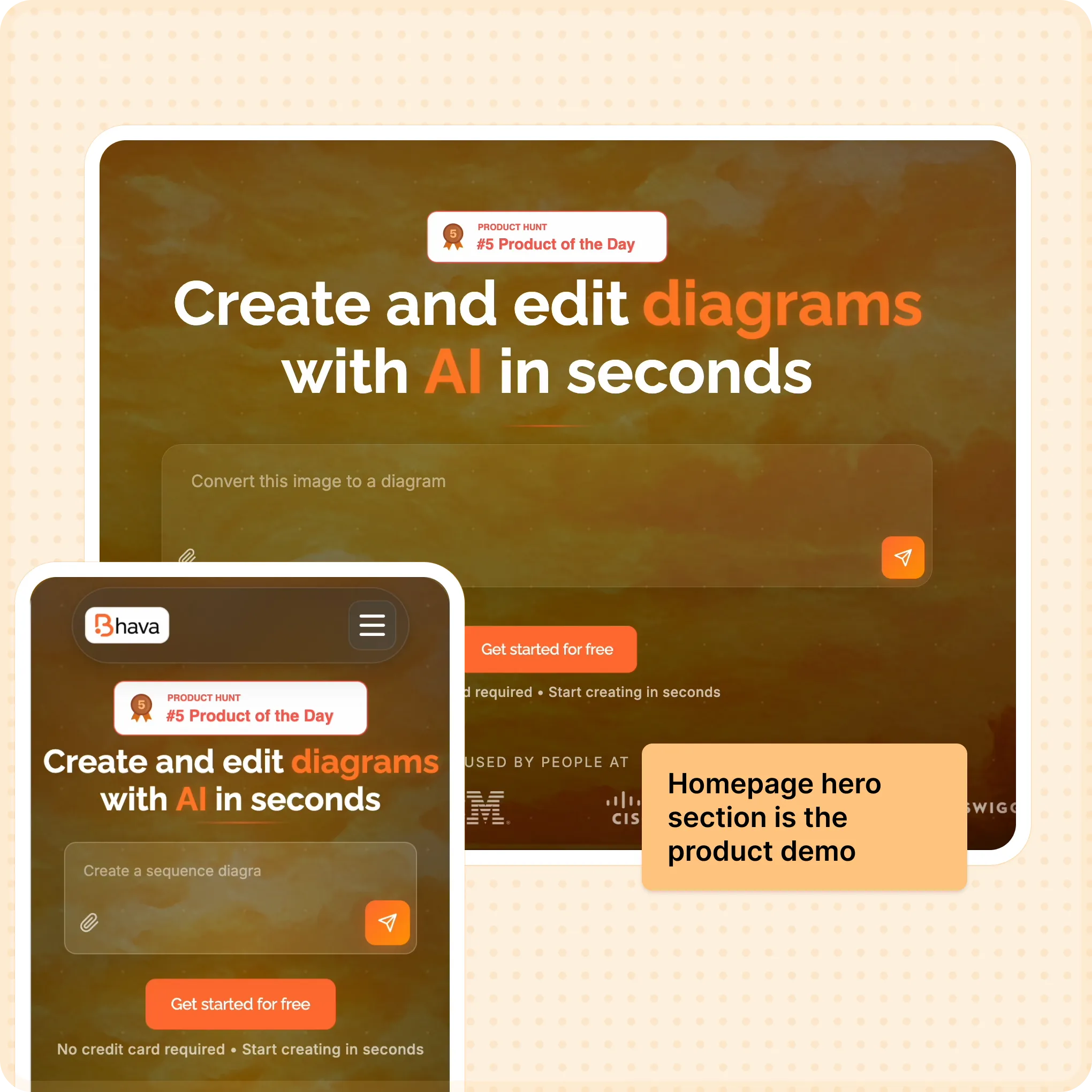
I added an interactive homepage demo and example chips so visitors could see what Bhava made before signing up. Landing conversion moved from 1% → 5% (+4pp). Diagram-type cards and 3-step onboarding then helped people turn that example into their own request; activation moved from 38% → 60% (+22pp).
I built on draw.io to keep the result editable. A generated PNG ends the conversation too early. A diagram you can change leaves room for the part the model misunderstood.
One dependable path beat a choice of inconsistent ones
Getting someone to generate a diagram only mattered if the result was usable. I retired the inconsistent “Basic” mode and kept one quality path. Bad-diagram tickets fell by 55%.
I also logged and grouped ~100 failed generations to find recurring problems. Flowchart sub-agents improved generation success by 70%, while caching kept cost flat. This work made reliability something I could inspect and improve each week, instead of hoping the next prompt would behave better.
A wait needs an explanation. So does a bill.
Visible progress steps gave the original seven seconds of waiting a sequence people could follow. Prompt caching also brought median generation time from 7.8s to 3.2s. Explaining the wait and shortening it addressed separate parts of the experience.
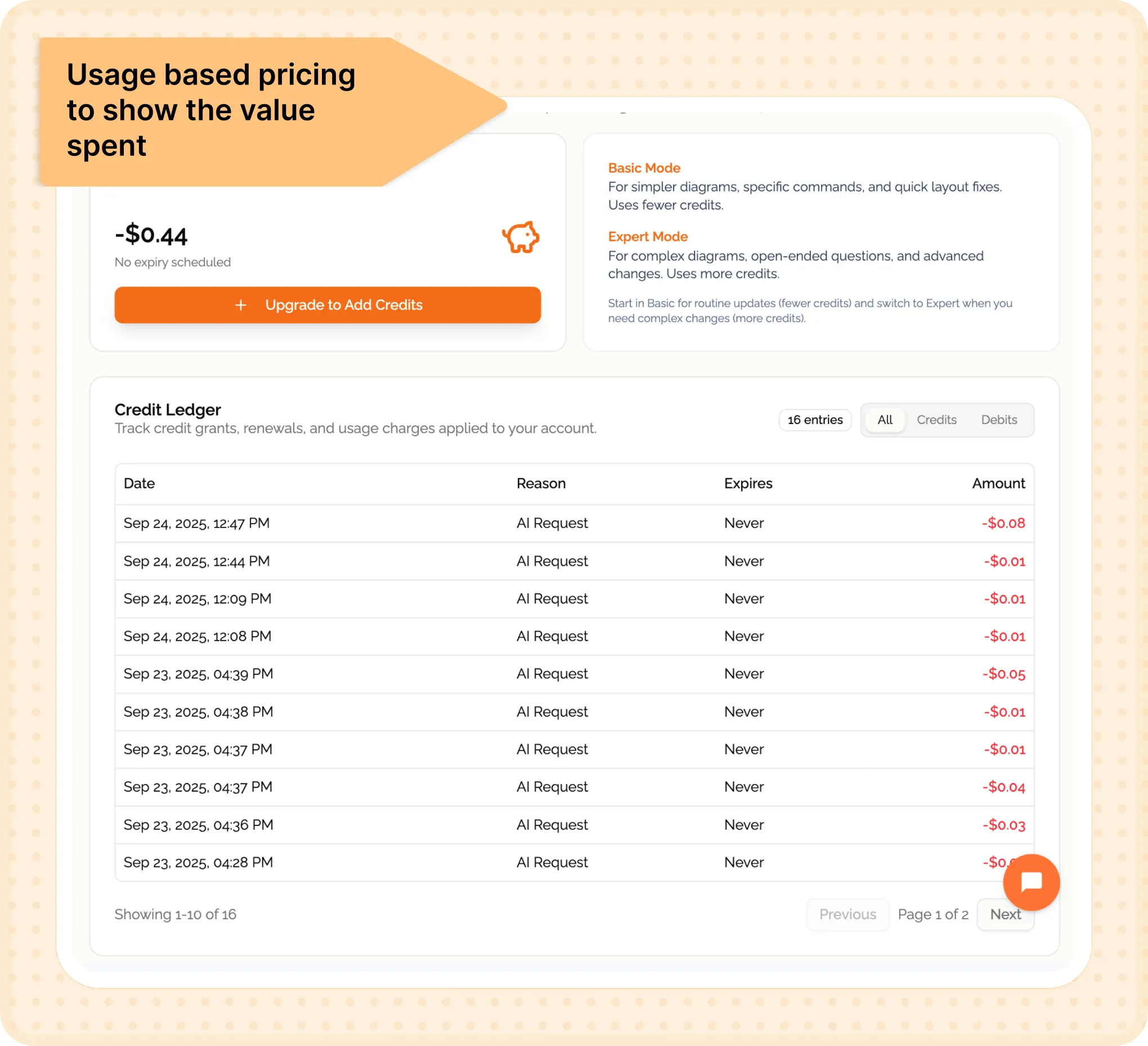
Usage-based credits and a live dashboard carried that visibility into payment. People could see their usage; I could see whether the product could sustain it. Margin moved from −22% → +14%, and billing questions fell by 60%. Transparent pricing still depended on output worth paying for.
Encouraging early signals, with more to learn
Day-7 retention stabilized at 30% after quality gating. These figures come from the first four weeks post-launch, while I was still refining instrumentation. I treat them as early signals across several changes, not isolated causal effects or established commercial performance.
The next focus is export rate: does a generated diagram become something people actually use? I would follow the path from first result through editing to export. If more people generate but still abandon the output, the next improvement belongs in the diagram, not the signup flow.
A useful first draft gives someone a place to begin. An editable one gives them a reason to stay.